

My Farrow & Ball Favorites
The paint colors that you need in your next project

I want to start out by pointing out how intelligent, good-looking, perspicacious, and clever all of my readers are.
(I know. Perspicacious. I had to look it up too. But it fit.)
And because you’re also a good judge of character and an arbiter of taste (and you are) you know when something looks great. And when it... well, doesn’t. Even if you can’t name it. Even when you can’t deliver exactly the right terminology, you just know “good” when you see it.
I bet this happens to you a lot. When presented with two options, you can almost always identify the higher-quality of the two. In a blind test, you typically choose premium. But you also love a good deal.
And we all know I’m exactly the same way. We’ve already discussed, at length, how I feel about Costco.
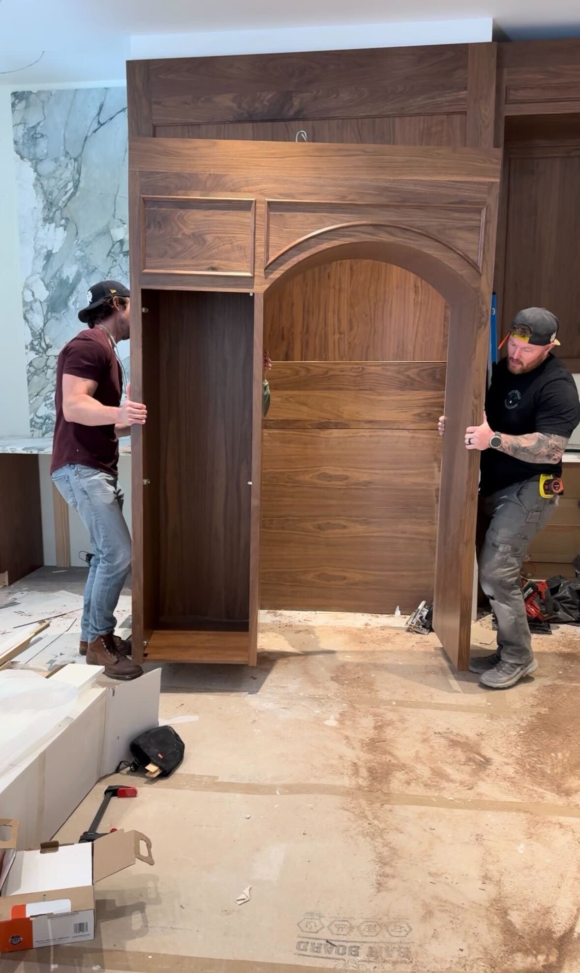
Which is, predictably, why building out our own design store has been — how do I put this — a carefully orchestrated financial event of operatic proportions.
Because I keep insisting on the highest quality of everything. Every cabinetry selection. Every fixture. Every finish.

I keep telling KC it’s because YOU, my dearest reader, deserve the best.
He keeps telling me that’s a very convenient framing for someone who recently stood in a warehouse whispering “but feel it” while running her fingers across a leathered slab of very pricey Cristallo quartzite.
To which I say: yes. And? Feel it.
Anyway.
Today I want to leave you armed with some of the insights we use to conjure that good-looking-room emotion in our own homes, and our clients’. Because it’s spring, and so spring cleaning is wrapping up, and the very next step in any spring-cleaning journey is fresh paint.
So I’m going to share my exact playbook to land the perfect paint color, finish, and sheen right now.
I’ll even include a free link to my templated paint schedule (the spreadsheet I send to every painter, every time) at the end. Because, say it with me, being organized makes all the difference.
Here we go.
My Farrow & Ball Hall of Fame
A note before we begin: I am a Farrow & Ball fanatic. Those of you who follow me on Instagram already know this. Not because I think other paint is bad. But because F&B paint has a response to light that I have not been able to replicate with any other brand, at any price point, ever.
It moves throughout the day. It deepens at dusk. It glows in the morning. It is, frankly, alive.
(See? This is the kind of behavior KC is contending with.)
Here are the colors I come back to again and again, broken into the categories I actually think about when I’m specifying a project.
The Workhorse Whites
These are the whites I reach for when someone says “just give me a great white.” None of them are stark. None of them are stale. All of them are forgiving.
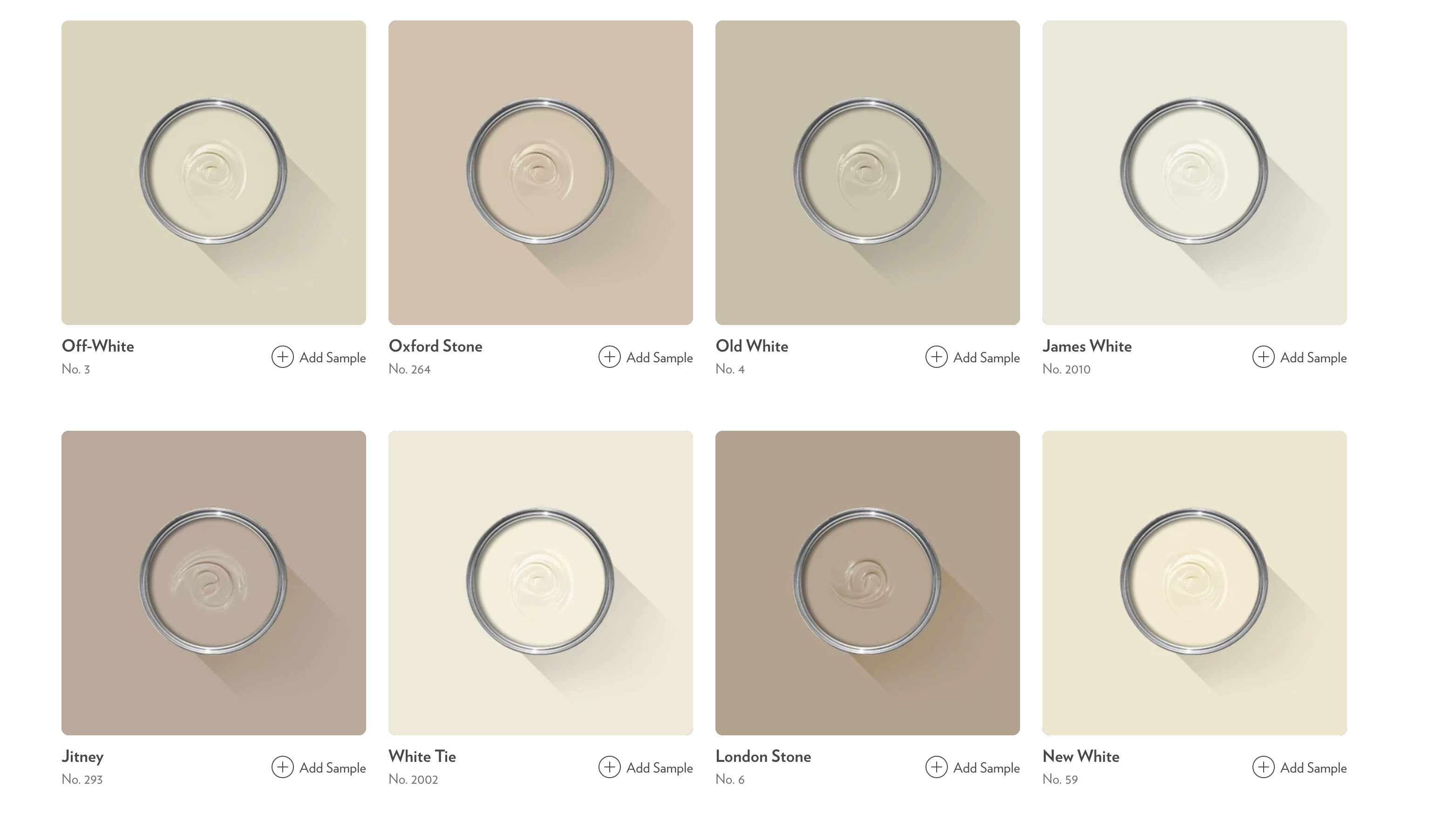
All White (No. 2005) — The cleanest white in the F&B lineup. Truly white, but never clinical. Best in north-facing rooms or anywhere you want crisp.
Pointing (No. 2003) — Named after the lime mortar between bricks. Warm, soft, the kind of white that makes a room feel slightly older (in the best way). My go-to for trim.
Wimborne White (No. 239) — Has the tiniest whisper of warmth. If you can’t decide between a true white and a cream, this is the answer.
School House White (No. 291) — Heavier on the warmth. Reads almost like a soft, sun-bleached cream. Beautiful on cabinets in a kitchen with brass fixtures.
Slipper Satin (No. 2004) — Named after the silk used in ballet slippers, which tells you everything you need to know. A creamy off-white that tips slightly chalky. Bedrooms. Always bedrooms.
The Quiet Neutrals (a.k.a. The Ones You’ll Live With Forever)
These are the colors people don’t expect me to recommend, because they’re not loud. But they are the ones clients come back to me about a year later and say, “I cannot stop looking at this wall.”
Mouse’s Back (No. 40) — A warm, slightly olive-tinged taupe. The most underrated F&B color in the entire collection, in my professional opinion.
French Gray (No. 18) — Despite the name, it’s actually a soft, dusty green-gray. Library-coded. Den-coded. Good-book-and-a-glass-of-something-coded.
Vert de Terre (No. 234) — Translates to “earth green.” It’s a pale, earthy, almost-celadon green. Stunning in a bathroom. Stunning on cabinetry. Just stunning.
Beverly (No. 310) — A clean, forest green. Reliable and warm — greener in daylight, more grounded in lower light. A beautiful choice for a study, a kitchen island, or any room you want to feel rooted.
Soft Blues & Greens
I know everyone wants me to recommend Hague Blue. I am not going to recommend Hague Blue. (Or is this my way of lowkey recommending it — you decide.) Here’s what I highkey recommend instead:
Light Blue (No. 22) — Don’t let the name fool you — it’s actually a soft greenish-gray-blue. It’s the color of a Swedish manor house in a movie you’ve never seen but feel nostalgic for.
Pigeon (No. 25) — Smoky, mid-tone, blue-gray-green. Devastating on cabinetry. Devastating.
Oval Room Blue (No. 85) — Named after the oval room in some grand house I’ll never be invited to. A deep teal-blue with green undertones. Dining rooms. Powder rooms. Anywhere you want to feel like you’re inside a jewelry box.
The Drama
These are the colors I recommend when a client says “I want something that makes people gasp when they walk in.”
Down Pipe (No. 26) — A deep, architectural gray with a hint of blue. The color of expensive raincoats and English drainpipes (hence the name). Iconic for a reason.
Cinder Rose (No. 246) — A dusty, smoky, slightly mauve pink. It sounds insane. It is not insane. It is, in fact, one of the most flattering wall colors ever invented.
Brinjal (No. 222) — Named after eggplant. A rich, deep, aubergine purple. Use it in a powder room and watch your guests audibly react.
Now — the part everyone gets wrong: the finish.
Here’s the truth no one tells you: the finish matters as much as the color.
You can pick the most beautiful color in the world, put it on the wrong finish, and watch it die on the wall.
Here’s my cheat sheet:
Dead Flat (0–2% sheen). The ultimate luxury. No reflection at all. Your walls look like velvet. The catch: it’s the most delicate finish, and not the easiest to wipe down. Use it in formal rooms, primary bedrooms, dining rooms — places adults live.
Estate Emulsion (2% sheen). Farrow & Ball’s signature wall finish. A whisper more durable than Dead Flat. This is what I default to for almost every wall in a house.
Modern Emulsion (7% sheen). Slightly more sheen, fully washable. This is your kitchen and bathroom wall finish. It’s the workhorse.
Estate Eggshell (20% sheen). The classic woodwork and trim finish. Soft, low sheen, doesn’t scream. Perfect for interior trim, doors, paneling.
Modern Eggshell (40% sheen). Tougher, more washable, slightly more reflective. This is what I use on kitchen cabinetry and high-traffic woodwork.
Full Gloss (95% sheen). Reserved for moments. A lacquered library. A glossy front door. A statement piece of trim. Use sparingly, like perfume.
The shortest version: Estate Emulsion on walls, Estate Eggshell on trim, Modern Eggshell on cabinets. That’s it. That’s the formula. Tape it to your fridge.
(And when you’re color drenching? Do the whole room in the same finish.)
And now, the actual reason I’m telling you all of this.
Drumroll.
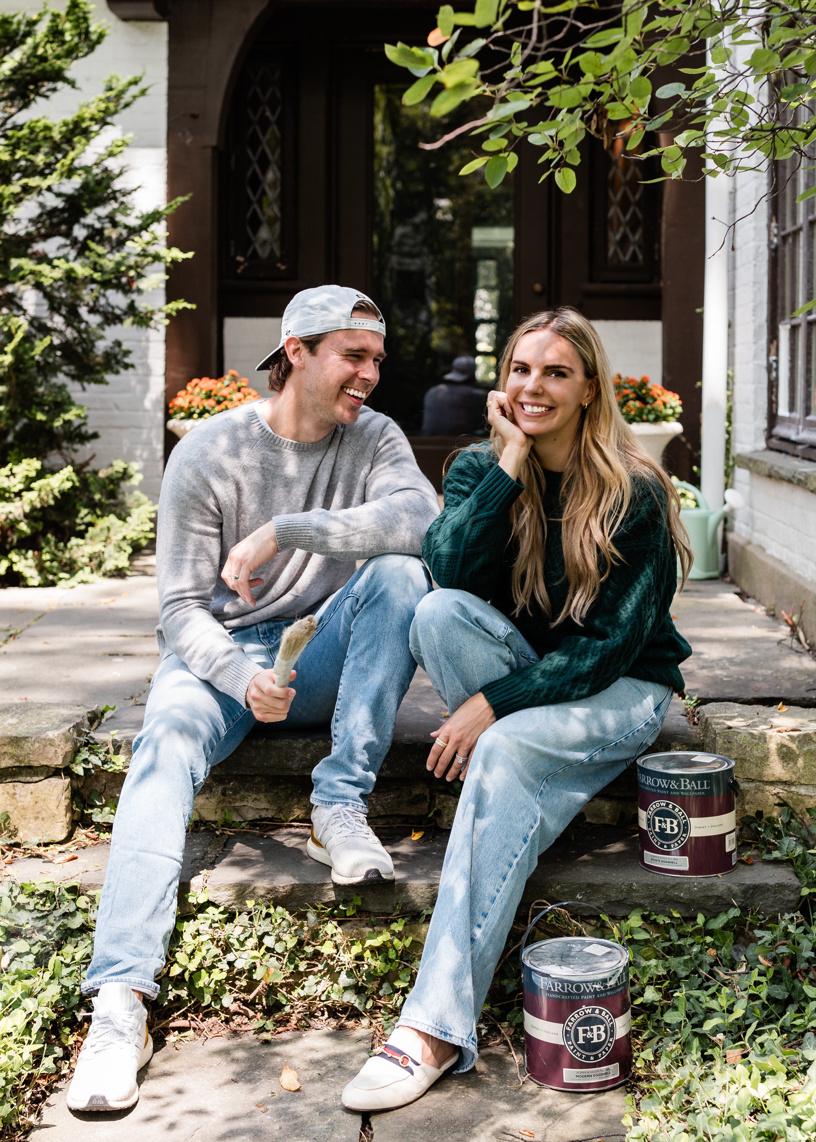
The Workshoppe by Kaage Homes is officially a Farrow & Ball stockist. 🎨
(I have been waiting months to say that out loud.)
Which means: every single classic Farrow & Ball color sample will soon be available in our Winnetka location. All of them. Every last weird, perfect, named-after-a-bird-or-a-vegetable shade.
But here’s where it gets interesting… and where I need your help.
We are stocking a limited number of store-ready gallons on our shelves. The rest we’ll have delivered to your door within 48 hours, but the ones that live in the store are the ones we believe you’ll reach for most.
So I want you to vote.
Tell me which Farrow & Ball colors you want to see lined up on our shelves the day you walk in. The ones you’ve been eyeing on Pinterest for two years. The ones you’re going to commit to this summer. The ones that, if you walked in and saw them ready to go, would make you say “finally.“
👉 CLICK TO: VOTE FOR YOUR FAVORITE F&B COLORS HERE 👈
Drop your top five. We’re tallying through the end of this week.
The winners get pride of place on the shelf. Everyone who votes gets early access to our launch event in June where we’ll be unveiling the full Workshoppe lineup — paint, fabric, hardware, the whole thing.
I cannot wait for you to see it.
Until next Sunday - from your favorite paint-obsessed pal,
Grace
P.S. Want my templated paint schedule? The exact spreadsheet I send to every painter, on every project, listing every room, color, finish, and sheen so nothing gets missed and no one ever paints the wrong wall the wrong color? Click HERE to download it free. Print it, fill it out, hand it to your painter, watch the magic happen.
P.P.S. New here? Hi! Welcome to the part of the internet where we talk about paint sheen & home strategy like it’s a moral position. Hit reply — I read every email and I will, without fail, get unreasonably invested in helping you create a home you love.